The biggest block of colour you wear
From November to March the coat is the largest piece of colour in most outfits, and the first thing anyone sees. Whatever is underneath has to live with it. That is why a coat's colour decides more about what you can wear with it than its collar, its length or its price.
Colour does three jobs at once. It sets the palette (which other colours look natural next to it), the contrast (how clearly the coat stands apart from the knit under it) and the temperature (whether the whole outfit leans warm or cool). Once you can see those three, choosing a coat colour stops being a guess.
Contrast and temperature, in plain words
Contrast is the difference in lightness between the coat and the knit beneath it. Squint at the outfit. If coat and knit turn into the same grey, the contrast is low and the outfit reads as one long block. If one is clearly darker than the other, the coat frames what is under it and the shape of the outfit is easy to read.
Temperature is whether a colour leans warm (camel, cream, rust, olive) or cool (navy, charcoal, steel blue). Black and mid grey are neutral and go either way. Warm and cool next to each other at nearly the same lightness tends to look accidental, because neither colour seems to be the one that was chosen. Either make the lightness clearly different, or move one colour towards the other.
The five coat colours
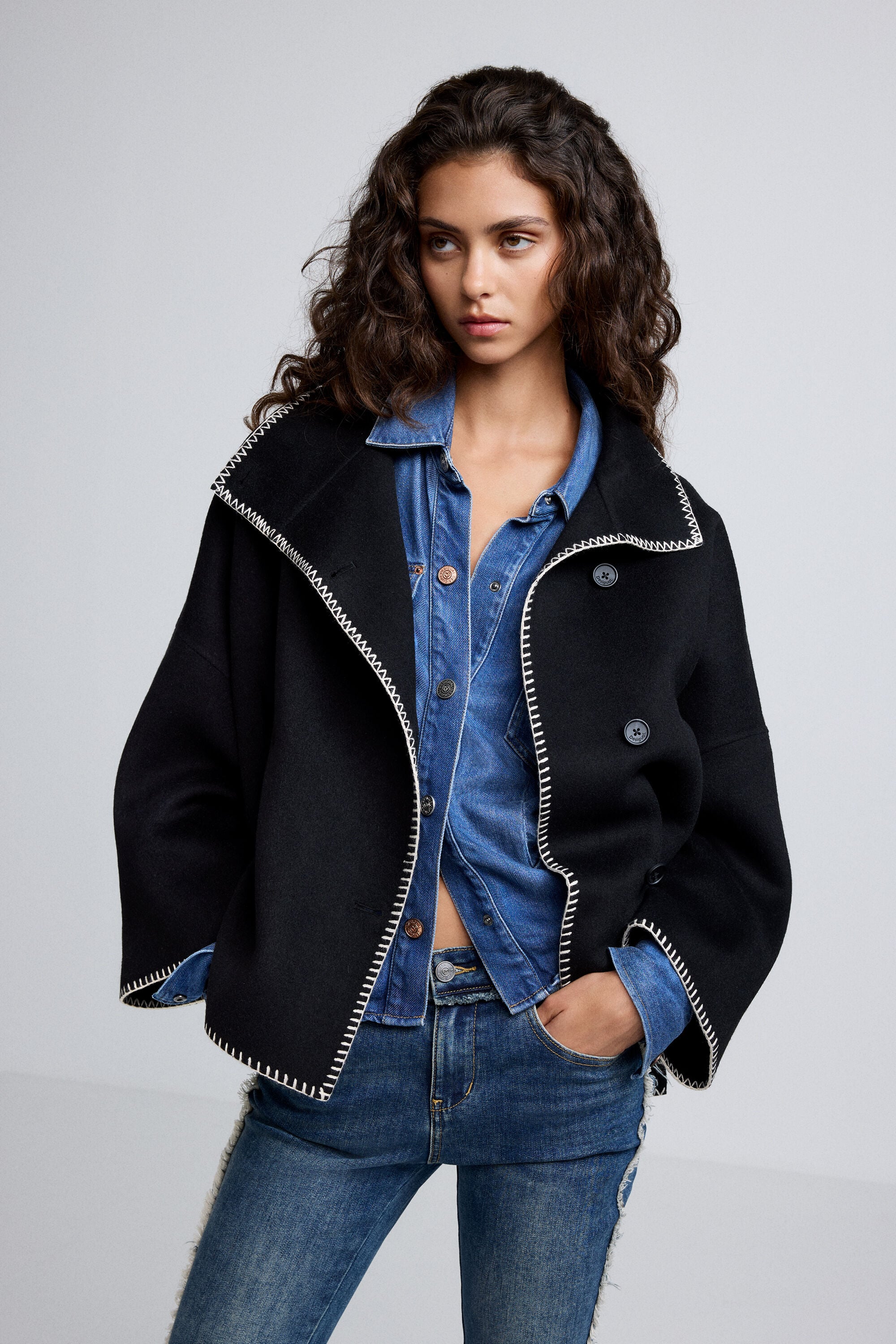
Black is the darkest anchor. It gives strong contrast against cream, grey and light denim, and it goes tonal with dark knits, which works when the textures differ. It also shows lint and dust more than you expect.
Navy is softer than black and leans cool. It sits well with grey, cream and white. Against warm mid-tones such as rust or mustard it is the colour most likely to look accidental, because navy and those colours are not far apart in lightness.
Grey is the middle of the scale and has no temperature, which is why it is the least demanding coat colour. In the figure above it gives a soft contrast with three of the four knits and a strong one with the fourth, simply because it sits far from both ends of the lightness range.
Camel is warm and mid-light. It is clearly different from dark knits and denim, and it agrees with cream, rust and olive. Camel with navy is a classic pairing because the lightness gap is wide enough to override the warm-and-cool difference.
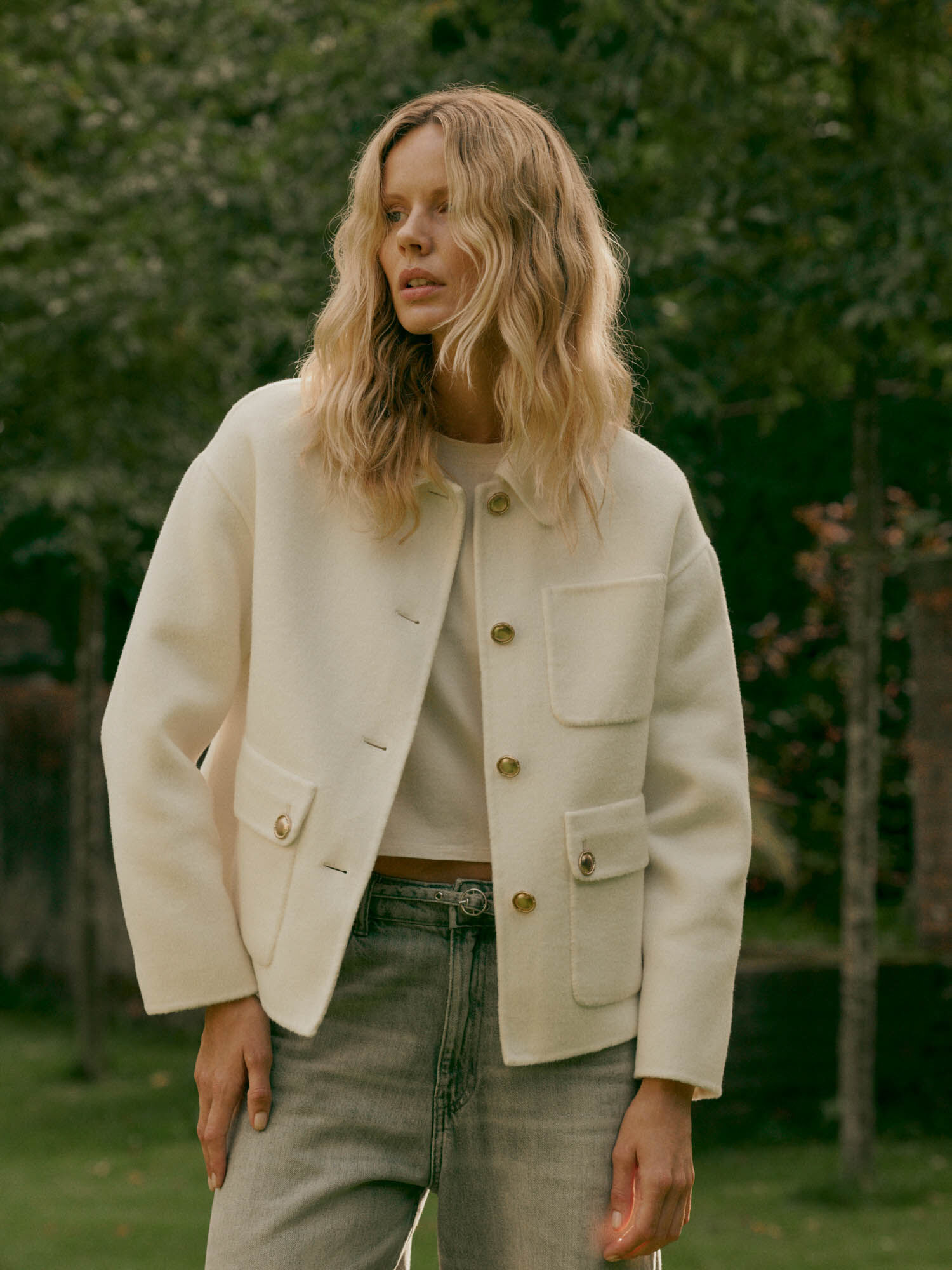
Cream is the lightest and the most striking against dark knits. It goes tonal with cream or stone, and it is the colour that shows marks soonest, so it suits people who do not mind regular cleaning.
Why lightness matters more than the colour name
People talk about coat colours by name, but the eye reads lightness first and hue second. Navy and black are different colours that sit close together on the lightness scale, so a navy coat over a black knit reads as tonal even though the colours are not the same. Camel and grey are different in temperature but similar in lightness, so both separate cleanly from a dark knit and from a cream one. If a combination looks flat and you cannot say why, lightness is nearly always the reason.
When to break the rule
Low contrast is not an error. A cream coat over a cream knit and stone trousers is a well-known look, and it works because the shades and textures vary within one family. A black coat over black works for the same reason. The rule only says: if you want the outfit to look planned, give it either a clear lightness gap or a clear single family, not something in between.
The cheapest way to use all of this is to look at what you already own. Hold the coat you have next to your three most-worn knits and squint. Often a scarf or a knit in a different lightness fixes an outfit that felt flat, and a coat you already have, or a second-hand one, is the most sensible way to add a colour.
What to look for
A colour that works with your own knits. Check it against the three pieces you wear most before anything else; a coat that suits all three will be worn more than a better coat that suits none.
A clear lightness gap or one family. Aim for either a coat that is clearly lighter or darker than your usual knit, or a deliberate single-colour outfit with varied textures.
Some texture in the cloth. A little weave or marl makes both light and dark colours look richer than a flat, glossy surface.
A fabric label you can read. The share of wool says more about drape and warmth than the colour name does, and a few lines on the label cost nothing to check.